Skip to content
MYO
RESTAURANT DESIGN

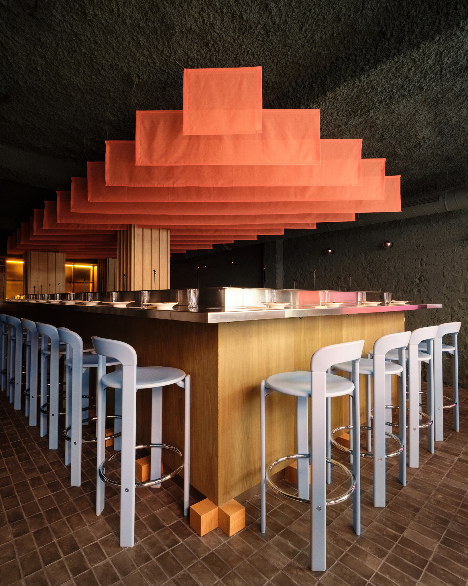
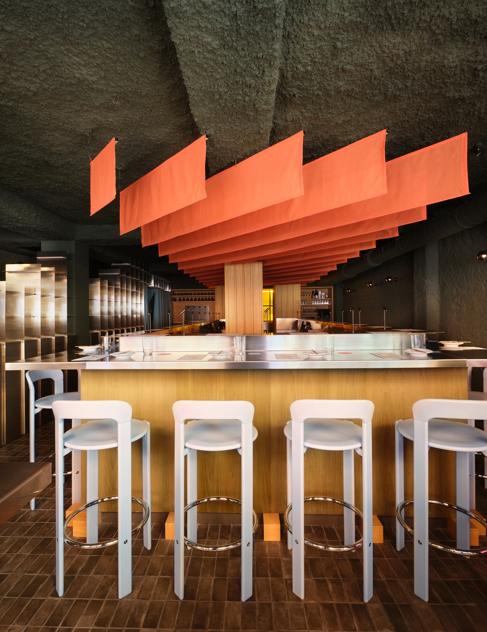
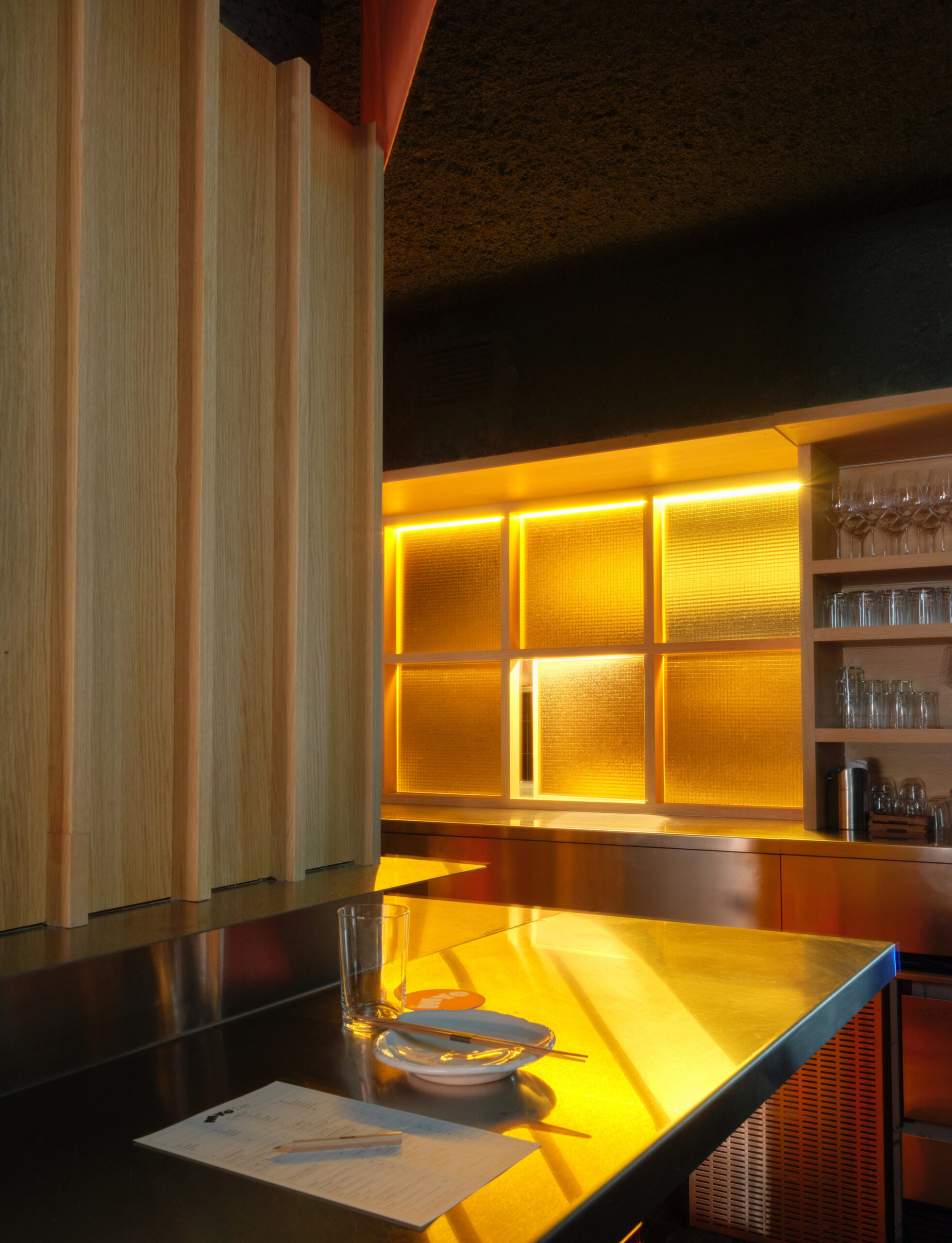
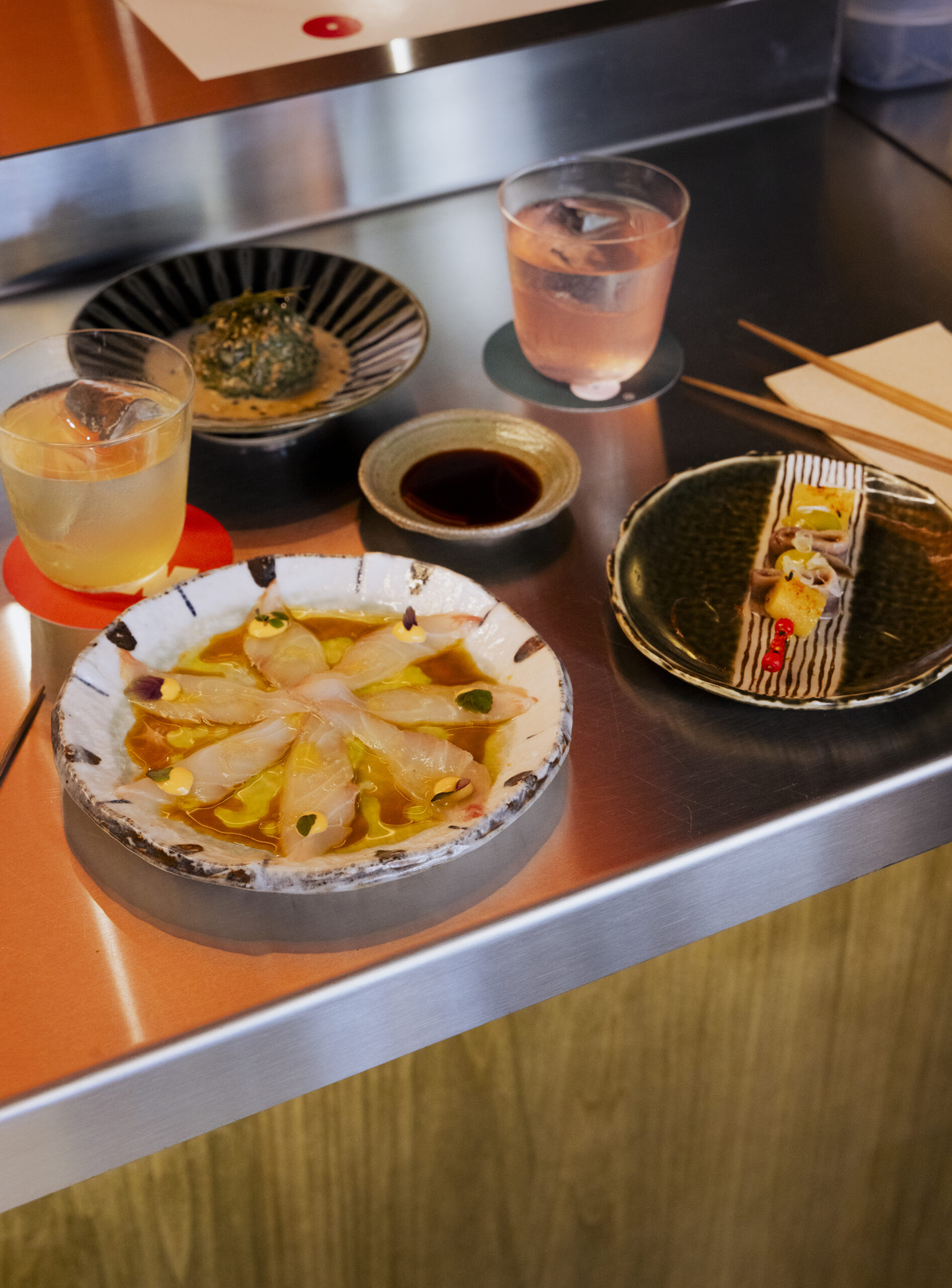
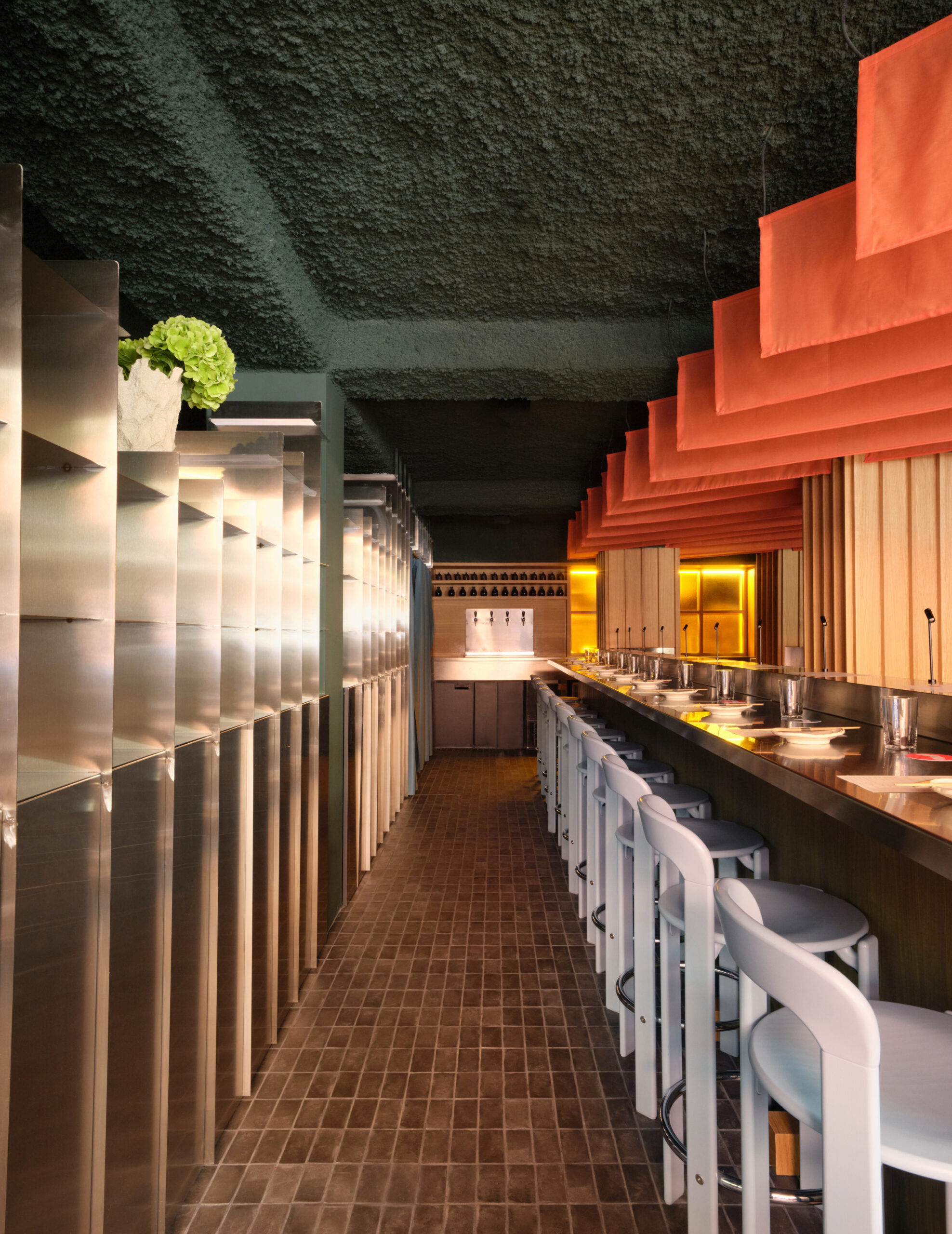
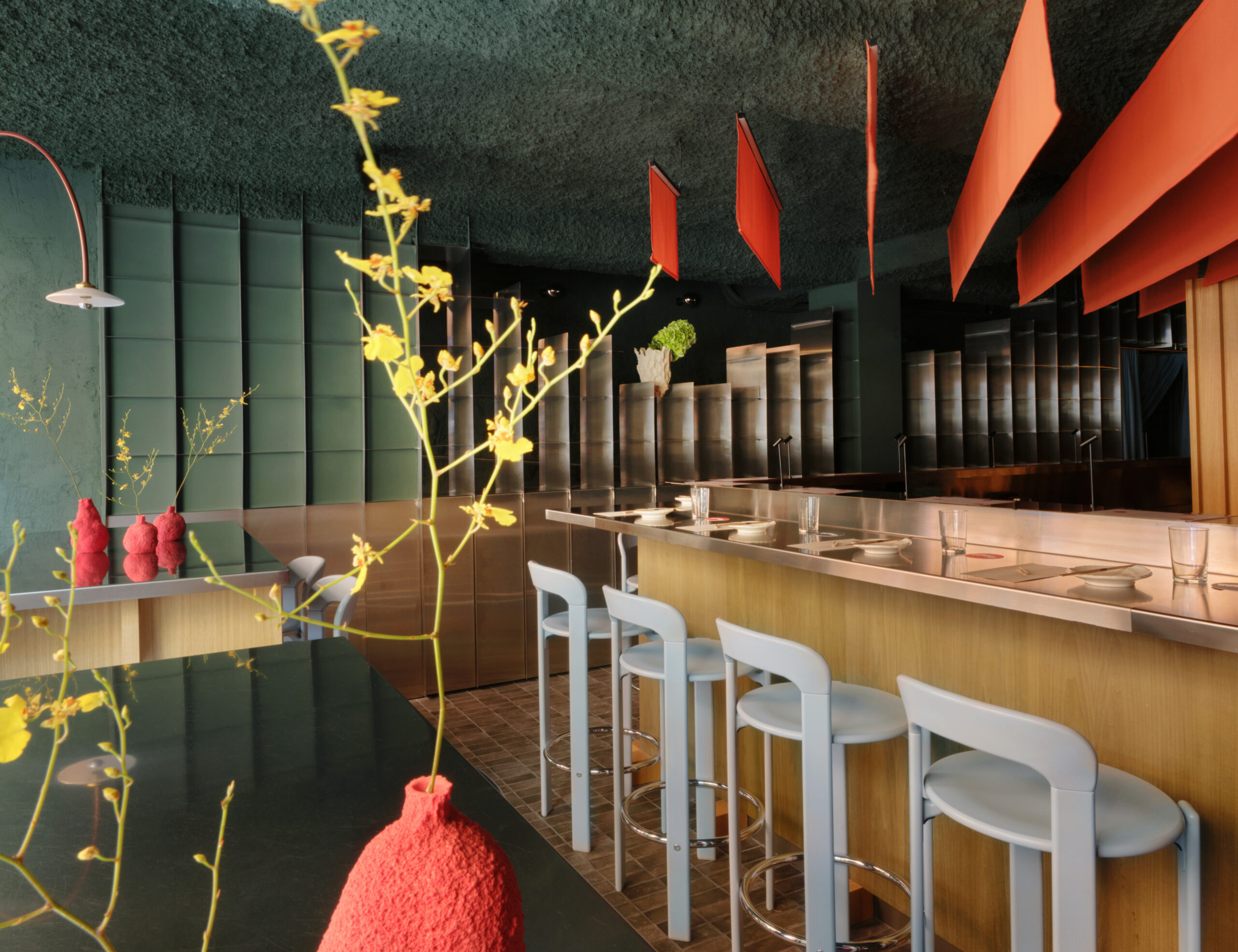
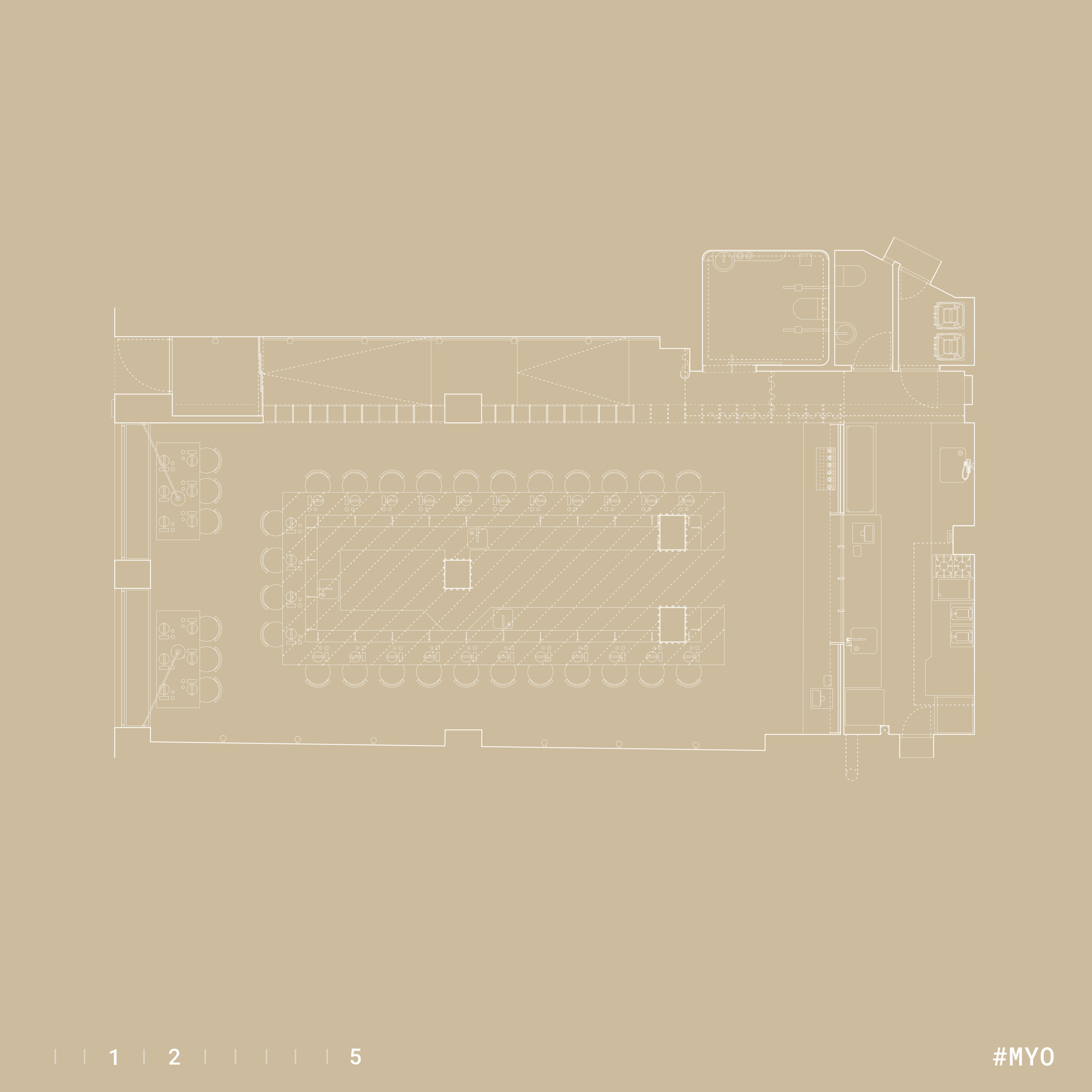
We were very clear that the bar had to be the true star of the show, elevated on a sort of oak wood platform and featuring a striking materiality with green-stained wood that reminds us of the color of nori seaweed. The stainless steel countertop tops off the upper section with spot lighting that frames the dishes as they are served.

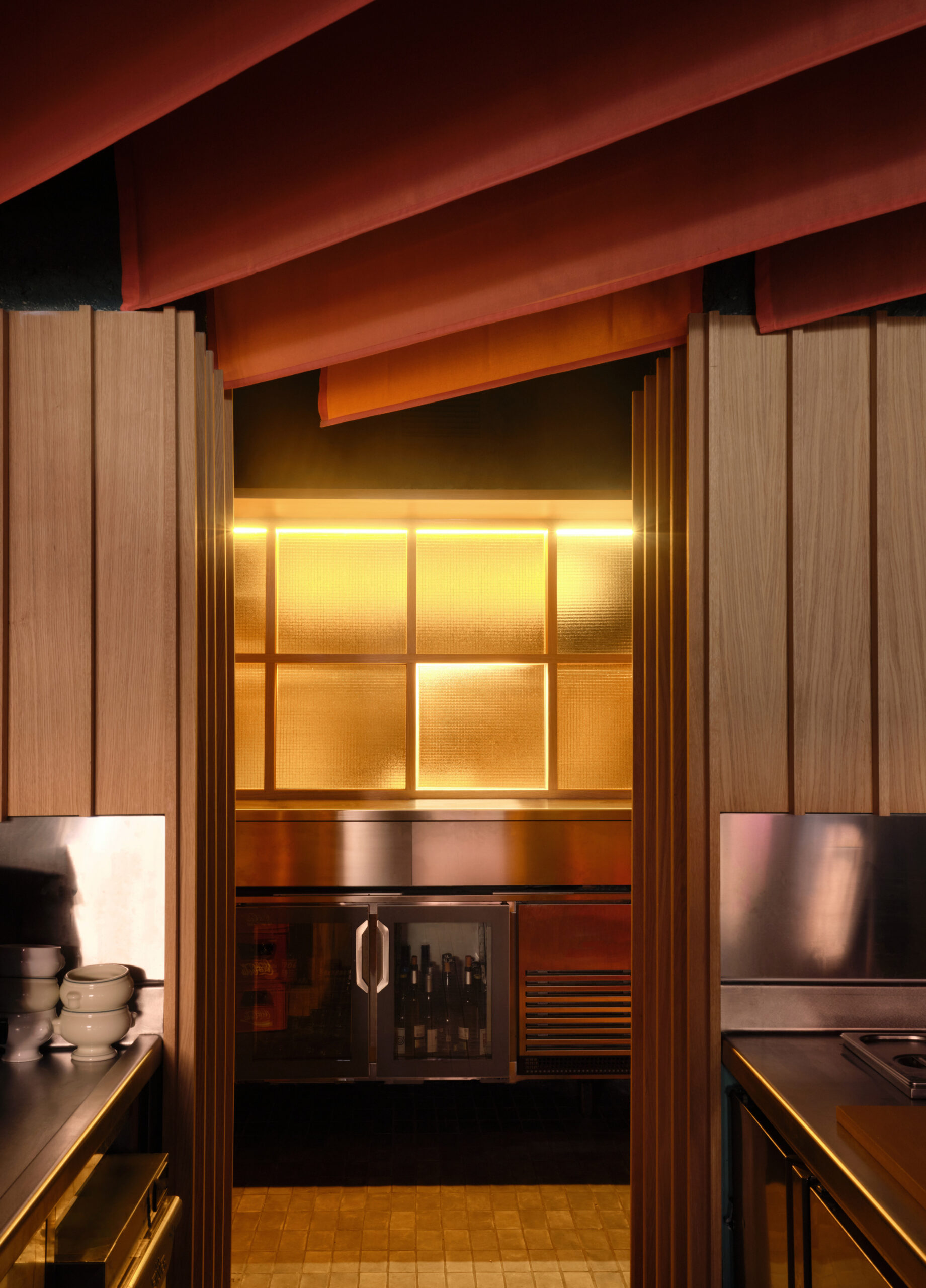
The bar is crowned by a continuous sunset effect achieved through backlit fabrics in warm colors.

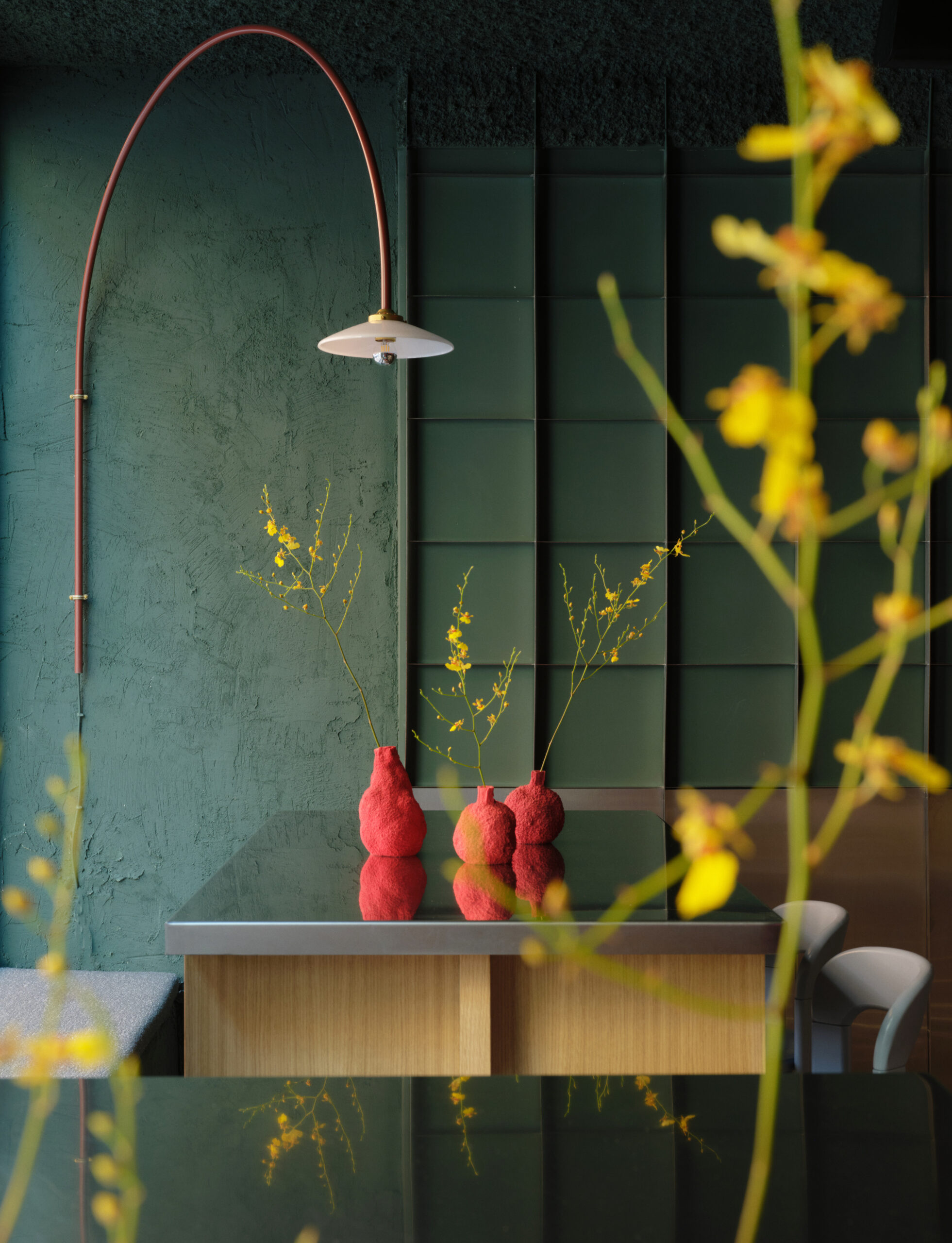
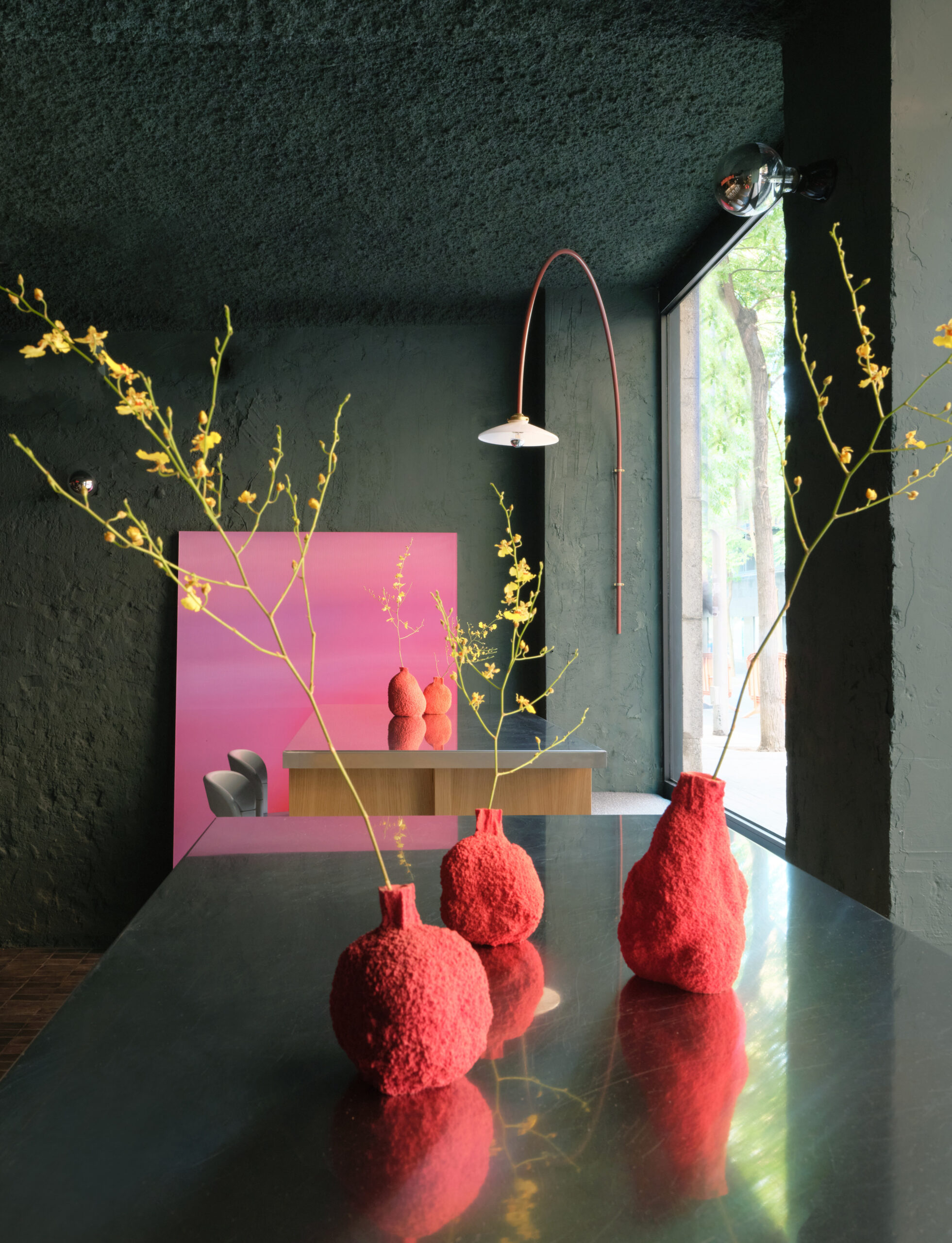
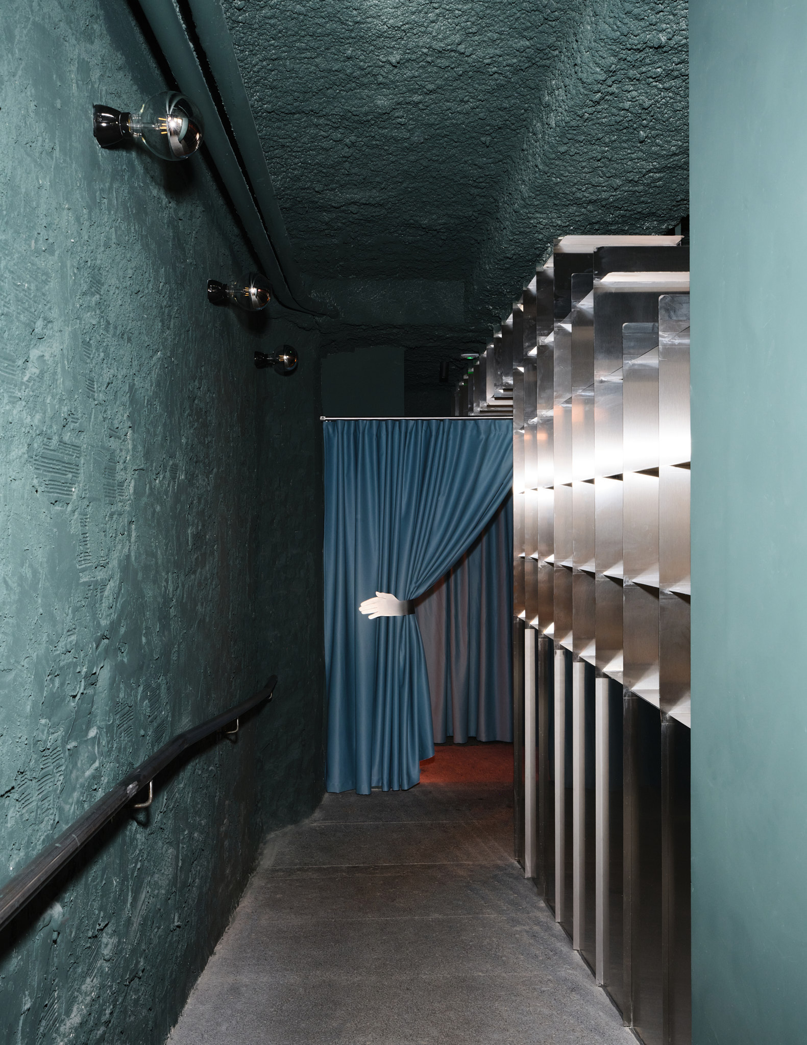
Everything surrounding the bar remains more raw to enhance that contrast, yet it is unified by a dark green that serves to soften the surroundings. Exposed piping and stainless steel complete the look, but what interested us most about the stainless steel was its ability to reflect the warm colors of the sunset, transforming a seemingly cold material into an explosion of warm colors when the lights are on.

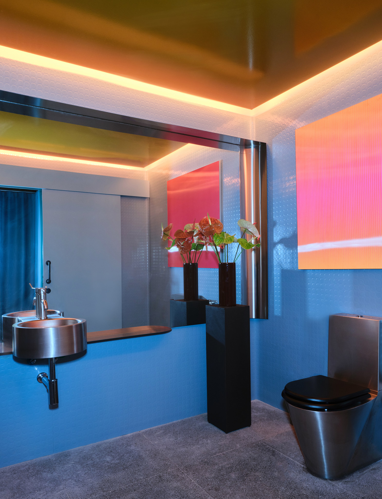
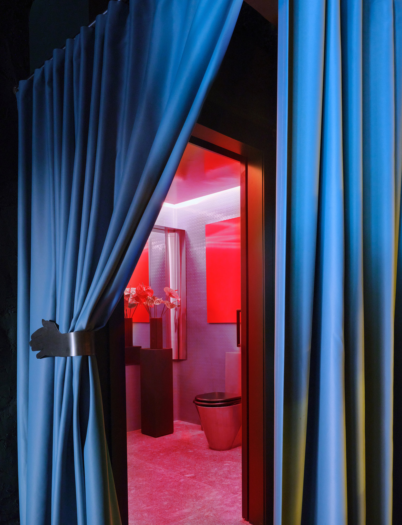
The metal shelving unit, which also serves as a room divider, greets visitors as soon as they arrive, guiding them to the entrance and the bathroom; it changes with the light, and the sunset effect is achieved thanks to the artwork by Fuensanta Sobejano.

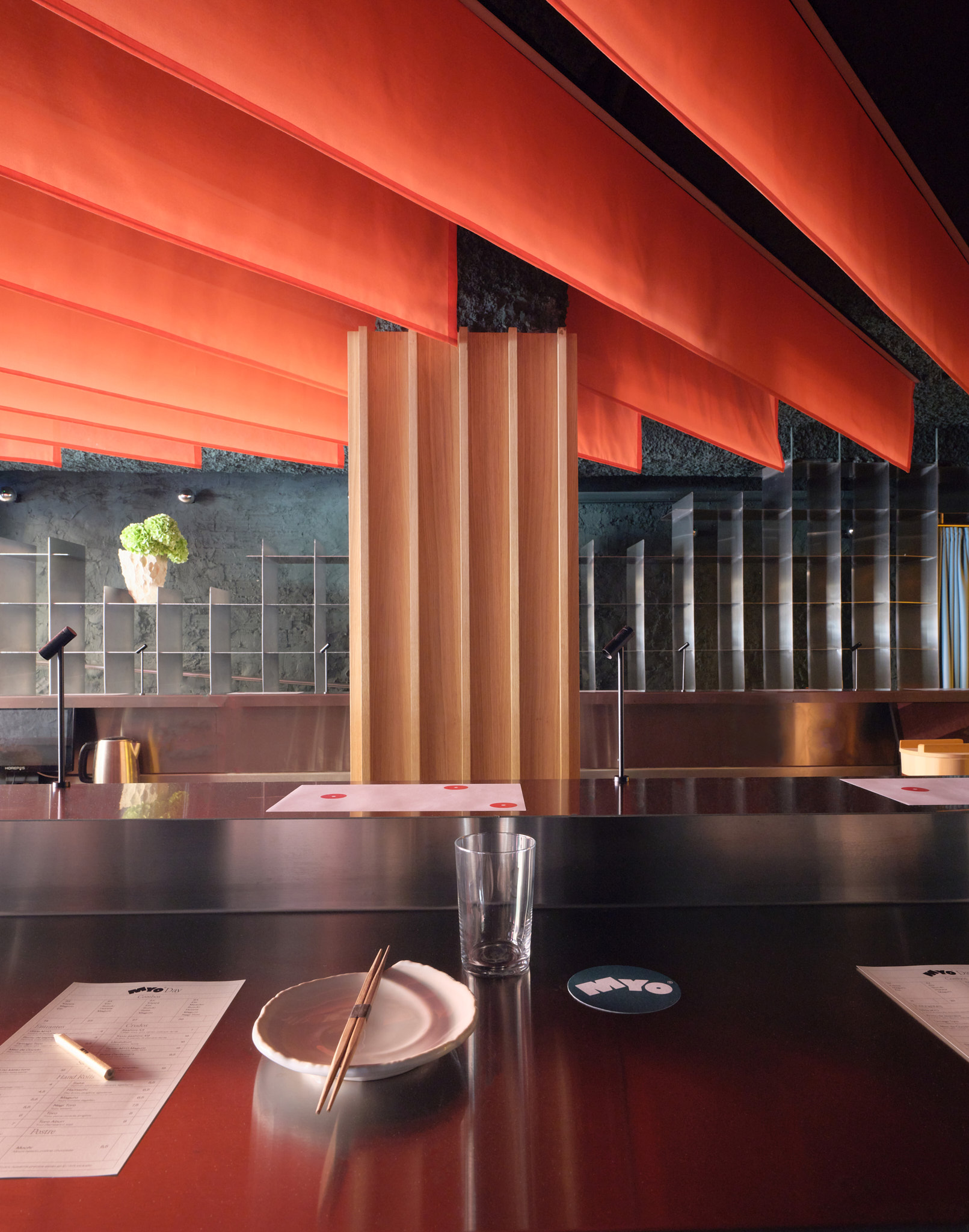
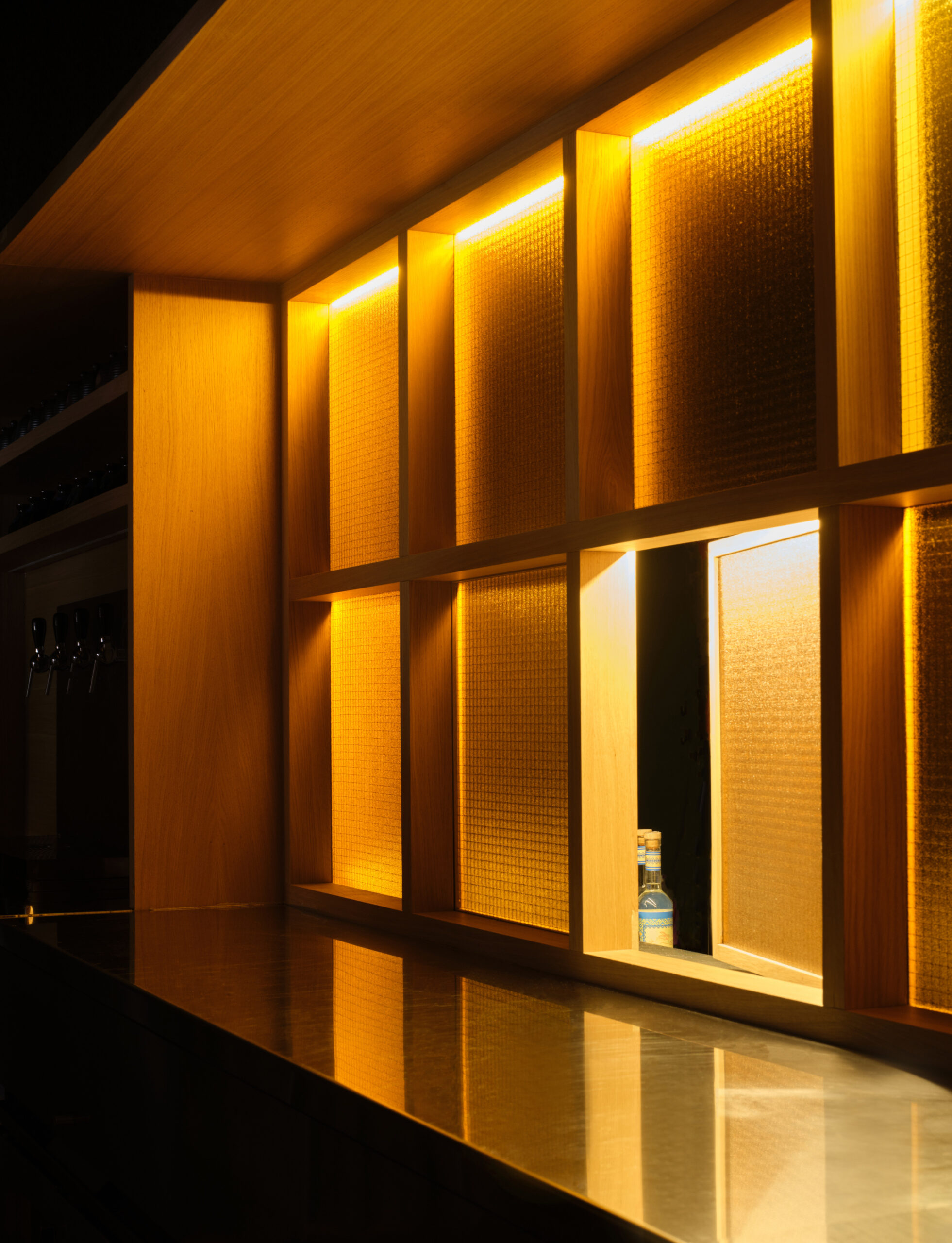
The warm colors evoking a sunset were the starting point for the @myo.handrollbar design; the orange textiles, yellow glass, and oak wood emphasize these plays of light. The importance of reflections and reflective materials also helps control the lighting. The spotlights built into the bar that illuminate the plate when it is served also help create an atmosphere of mystery and return to the concept of seeing without being seen.

We wanted to connect the bar to the kitchen using a wooden structure and translucent yellow glass that would serve as a shadow panel. We treated it like a shadow stage that hints at what’s behind it without revealing it.

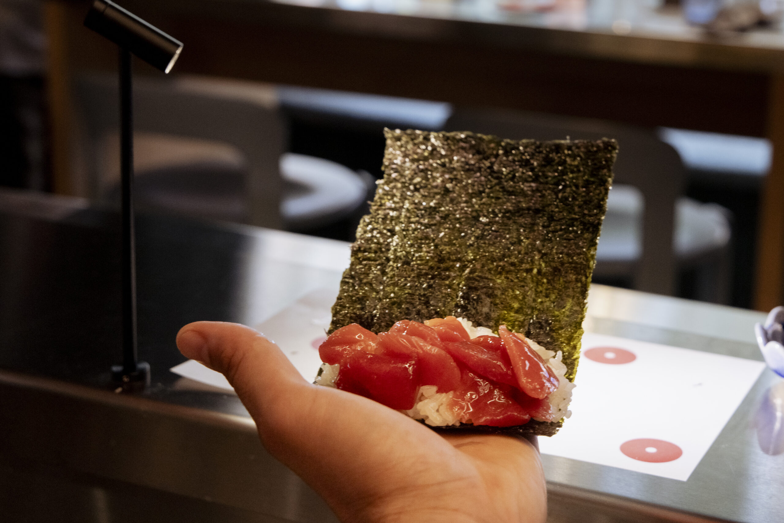
The biggest challenge was finding a color palette that was very Plutarco-esque and also suited the type of restaurant. We decided to focus on the colors we envisioned in the hand rolls: the dark green of the seaweed, the orange-red of the salmon and tuna, the blue of the white fish… this color palette went hand in hand with the graphic design by Irene Girona, with whom we connected from the very beginning.

Area: 115 m2
Client: privado
Design: Plutarco
Location: Madrid
Photographs: Pablo Zamora

MYO
RESTAURANT DESIGN

We were very clear that the bar had to be the true star of the show, elevated on a sort of oak wood platform and featuring a striking materiality with green-stained wood that reminds us of the color of nori seaweed. The stainless steel countertop tops off the upper section with spot lighting that frames the dishes as they are served.

The bar is crowned by a continuous sunset effect achieved through backlit fabrics in warm colors.

Everything surrounding the bar remains more raw to enhance that contrast, yet it is unified by a dark green that serves to soften the surroundings. Exposed piping and stainless steel complete the look, but what interested us most about the stainless steel was its ability to reflect the warm colors of the sunset, transforming a seemingly cold material into an explosion of warm colors when the lights are on.

The metal shelving unit, which also serves as a room divider, greets visitors as soon as they arrive, guiding them to the entrance and the bathroom; it changes with the light, and the sunset effect is achieved thanks to the artwork by Fuensanta Sobejano.

The warm colors evoking a sunset were the starting point for the @myo.handrollbar design; the orange textiles, yellow glass, and oak wood emphasize these plays of light. The importance of reflections and reflective materials also helps control the lighting. The spotlights built into the bar that illuminate the plate when it is served also help create an atmosphere of mystery and return to the concept of seeing without being seen.

We wanted to connect the bar to the kitchen using a wooden structure and translucent yellow glass that would serve as a shadow panel. We treated it like a shadow stage that hints at what’s behind it without revealing it.

The biggest challenge was finding a color palette that was very Plutarco-esque and also suited the type of restaurant. We decided to focus on the colors we envisioned in the hand rolls: the dark green of the seaweed, the orange-red of the salmon and tuna, the blue of the white fish… this color palette went hand in hand with the graphic design by Irene Girona, with whom we connected from the very beginning.

Area: 115 m2
Client: privado
Design: Plutarco
Location: Madrid
Photographs: Pablo Zamora